We started with a value scale. Sarah first made a rich black from Ultramarine Blue+Burnt Umber ( I never use the pre-made black).
Next she mixed the black with varying degrees of Titanium White, to arrive at a final scale ranging from white through all the light grey values, to mid-tones and into dark values, ending in black.

Next she sketched out the still life onto the canvas paper with vine charcoal.

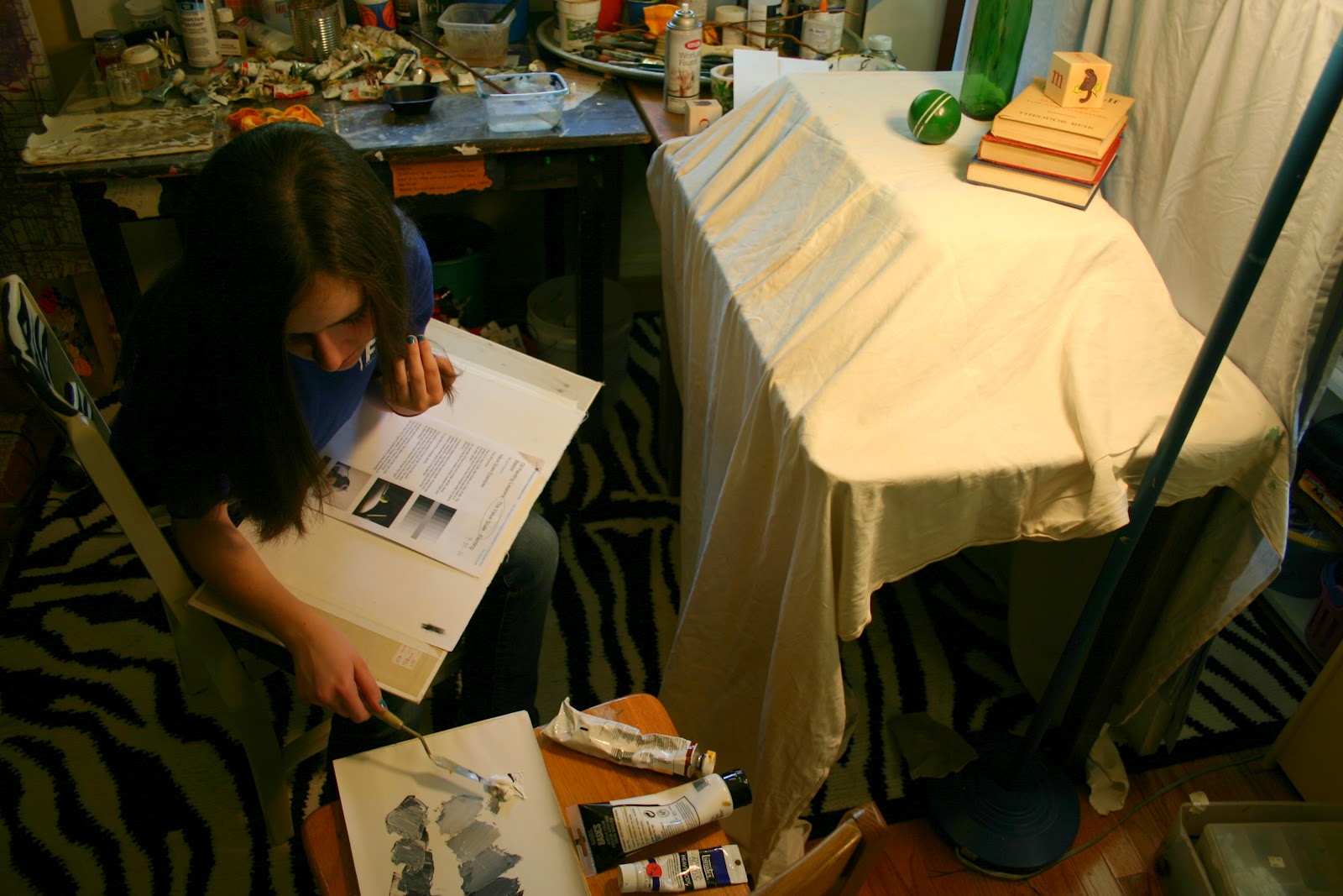
We used a simple still life with basic shapes for this value lesson.

While Sarah was working, I asked her lots of questions to get to know her better: artistic interests, likes/dislikes, favorite music so I can make an appropriate playlist for her lessons, favorite subject matter, hobbies, etc...I do this with all my students early on so I can get a feel for their personality as well as plan a schedule of interesting and appropriate lessons for her. Since no two are alike, I tend to tailor lessons specifically for each individual.


A gave her a little demonstration of what we were going for with the painting of the objects. Nothing super-realistic or perfect, but the aim is to match the correct value for each object and its cast shadow.

Sarah's value painting underway, and she's doing a great job!

Usually sometime around the first few lessons, I put together a little starter drawing kit (graphite pencils 2B and 4B, erasers, charcoal sticks, a little sketchpad...) for my students. For years, I have been saving the paper palettes with dried-up paint, thinking I would somehow use the dried paint in an abstract painting or collage-type piece. Today I decided I'd make a special paper bag for her kit, and this is the finished product. I just peeled pieces of paint off the paper palettes and adhered them to the bag with matte-medium in an abstracty pattern. Cute for art-related gifts!

Xoxo,
Beth
No comments:
Post a Comment